

Official Distributor of Renesans Polska Art Supplies
Discover 14 New Renesans Intense Watercolour Colours
There is always something exciting about discovering new watercolour paints to add to your watercolour palette. Whether you love painting delicate florals, expressive landscapes, atmospheric skies or experimenting with beautiful pigment effects, the right colours can open up a whole new world of creative possibilities.
And there is plenty to get excited about!
Renesans has expanded its Intense Watercolour Tubes collection with 14 new colours, bringing an exciting selection of pinks, violets, reds, blues, greens and atmospheric greys to the range.
From soft, delicate pastels to rich, expressive shades, these new additions offer plenty of inspiration for watercolour artists looking to refresh their palettes and try something different.
Some colours are perfect for beautiful floral washes, others lend themselves to dramatic landscapes, while several offer particularly interesting possibilities for granulation and natural pigment separation.
Let’s take a closer look at all 14 new shades.
Explore the 14 New Renesans Intense Watercolour Colours
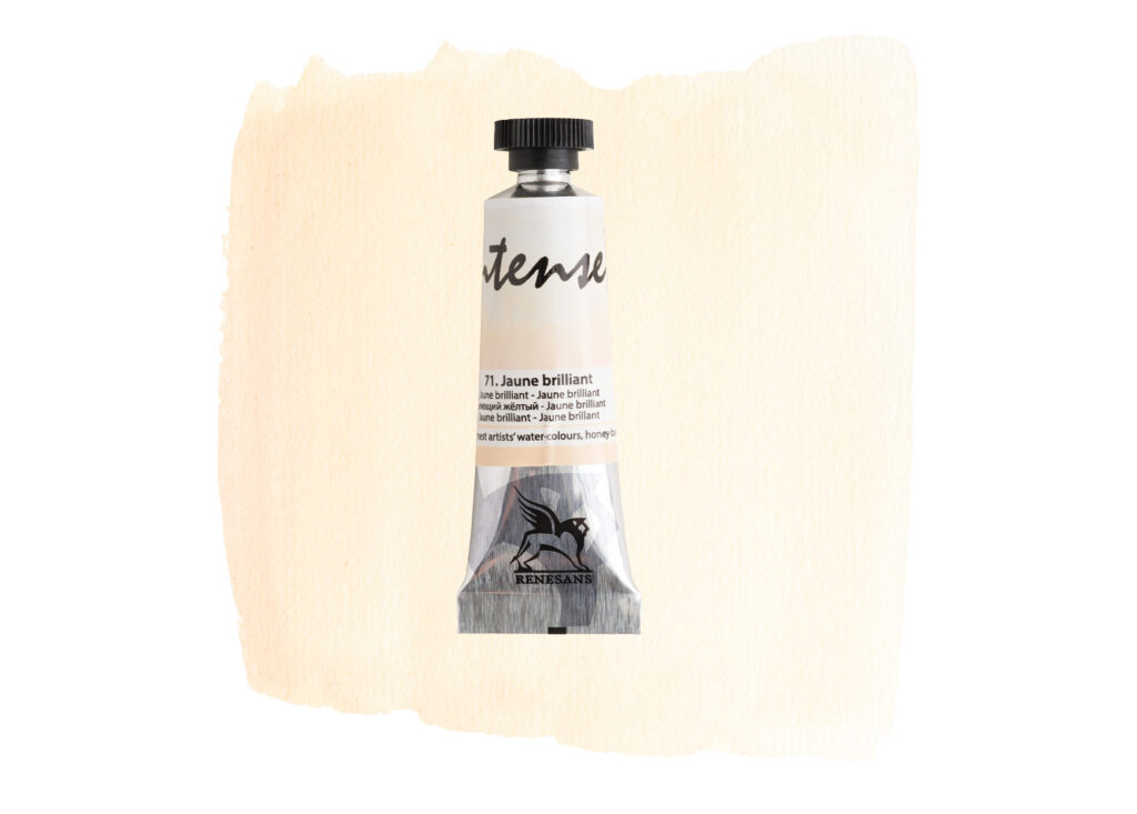
71. Jaune Brilliant
A beautiful soft, creamy yellow with warm golden undertones. Jaune Brilliant is a lovely choice for painting gentle sunlight, warm highlights, delicate florals and subtle colour transitions.
It is also a wonderful colour to experiment with when creating soft, warm mixes for skies and landscapes.
72. Bright Rose
A delicate, light pink with lovely warm rosy undertones. Bright Rose is an excellent addition to a floral palette, perfect for painting petals, romantic pink washes and soft atmospheric details.
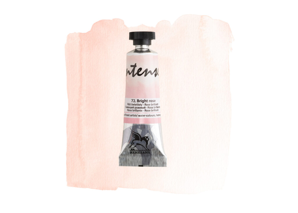
Try combining it with your favourite reds and violets to discover even more beautiful pink shades.
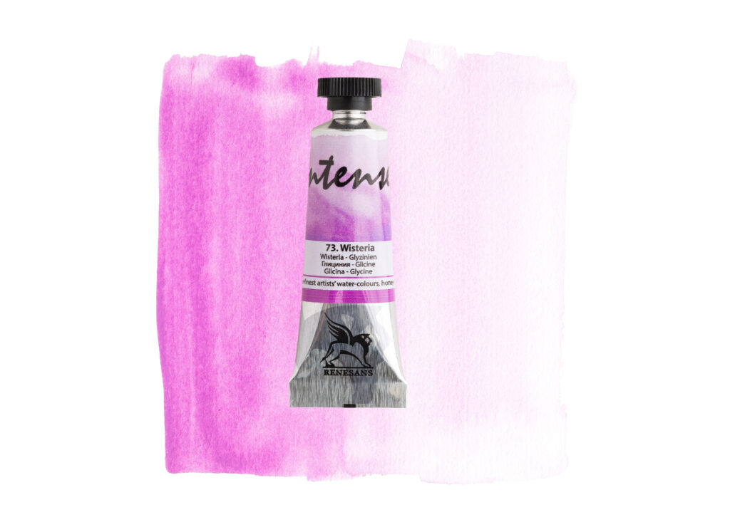
73. Wisteria
A vibrant pinkish-purple with beautiful violet undertones. Wisteria is a lovely expressive colour for floral paintings, colourful backgrounds and eye-catching washes.
If you enjoy working with pinks and purples, this is certainly one to explore.
74. Lavender
Soft, cool and wonderfully delicate, Lavender brings gentle blue-violet tones to your palette.
It is a beautiful choice for painting lavender flowers, distant mountains, atmospheric skies and soft shadows.
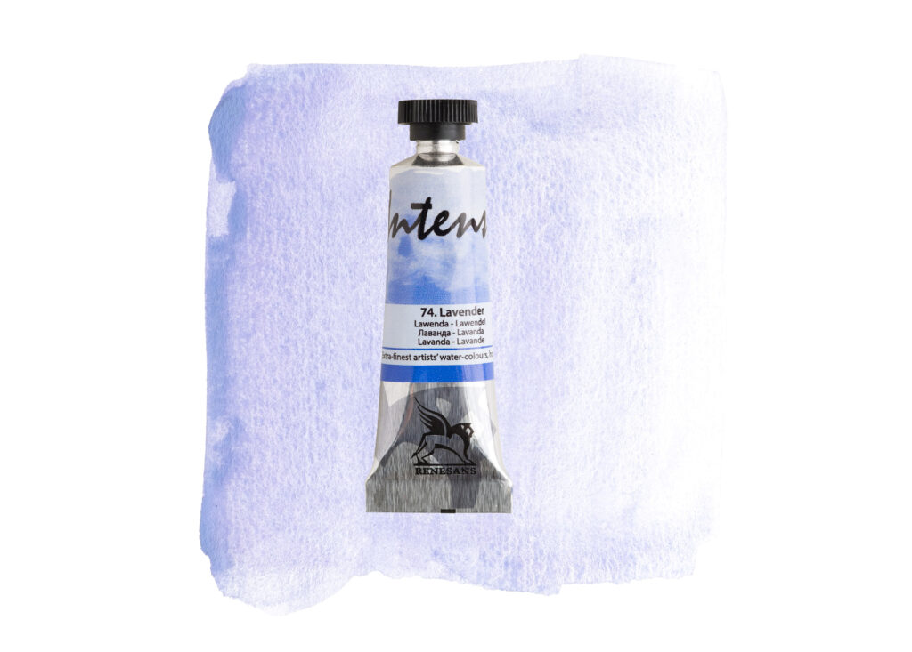
Its interesting pigment behaviour also makes it worth experimenting with on textured watercolour paper.
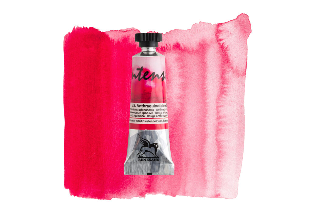
75. Anthraquinoid Red
A rich, intense crimson with striking pink undertones. This is a more dramatic addition to the new collection, ideal for expressive florals, bold washes and adding depth to your red colour mixes.
A lovely option if you enjoy working with deep reds and vibrant pinks.
76. Alpenglow
A delicate, muted blue with subtle lavender undertones. Alpenglow is an interesting colour for atmospheric landscapes, soft skies and beautiful blue-violet colour combinations.
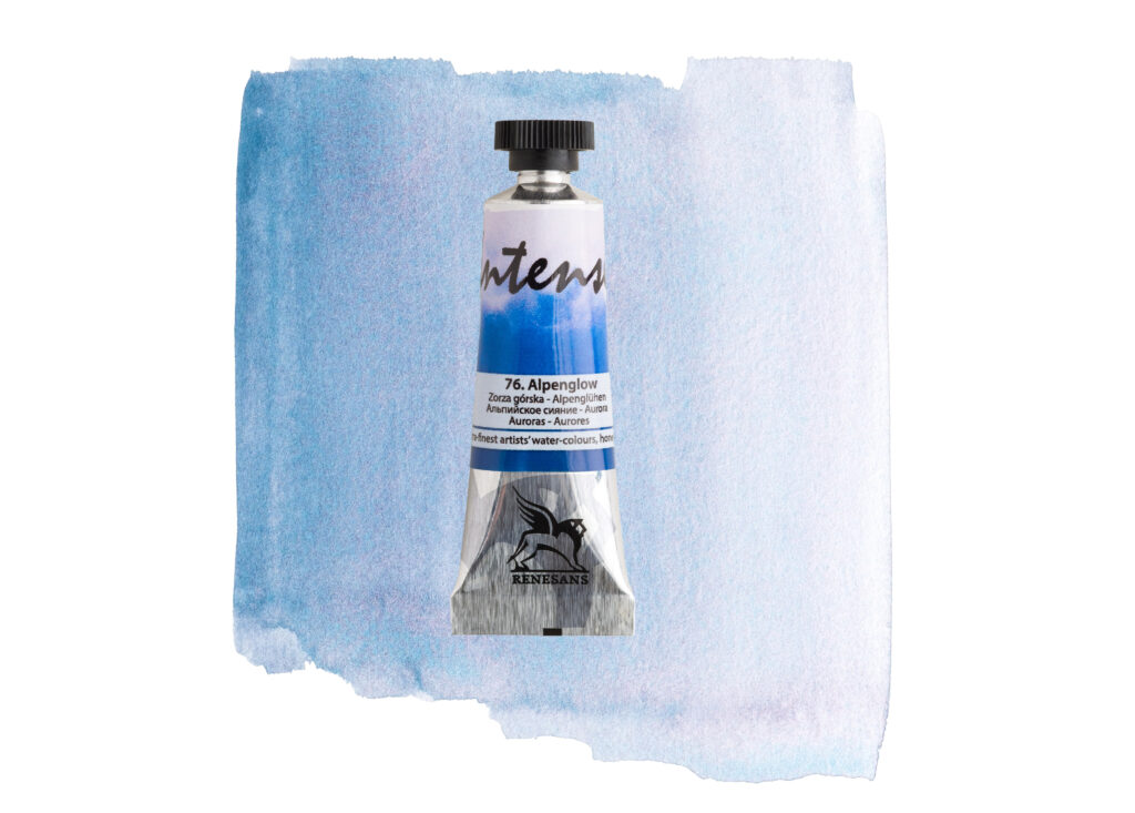
Its natural pigment separation offers another reason to experiment with this shade, particularly when working with wet-on-wet watercolour techniques.
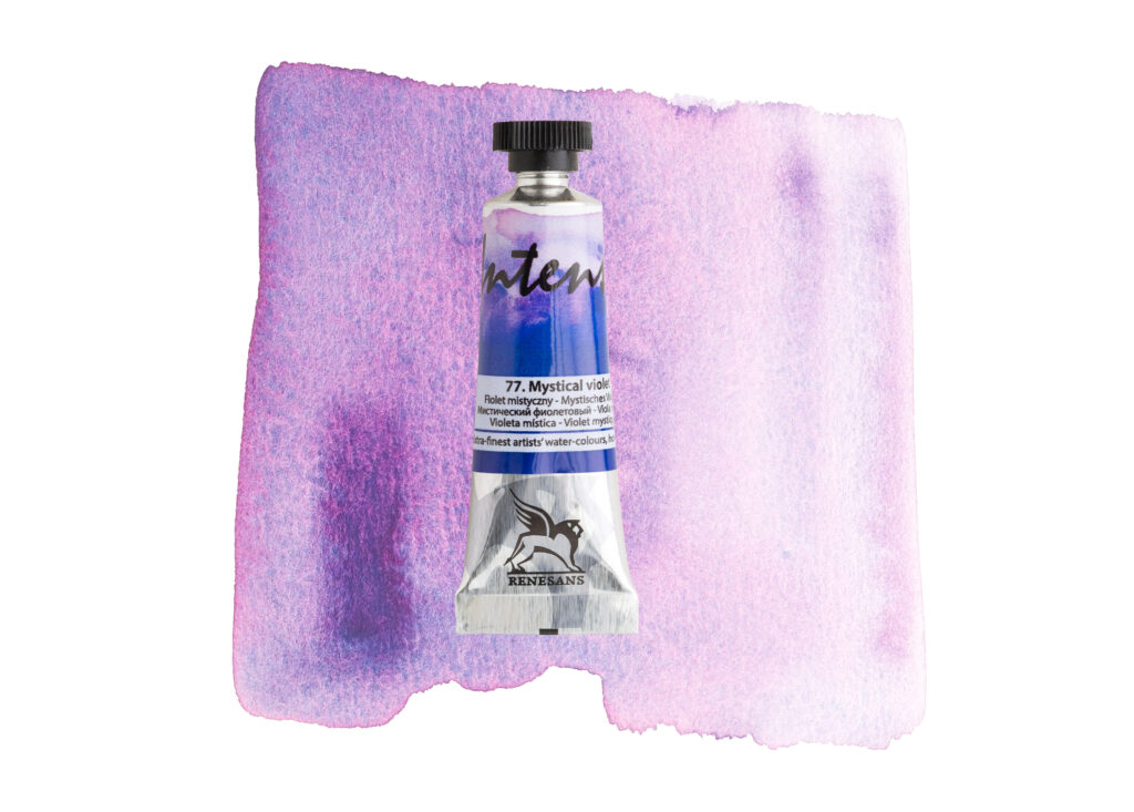
77. Mystical Violet
A dreamy violet with hints of pink and lilac. Mystical Violet is a beautiful addition for floral artists and anyone who enjoys creating expressive, atmospheric colour washes.
It offers plenty of possibilities for combining soft violet tones with pinks, blues and other complementary shades.
78. Verditer Blue
A fresh, light blue with lovely cool undertones. Verditer Blue is a versatile addition to any watercolour palette, particularly useful for painting clear skies, water, distant landscapes and delicate blue details.
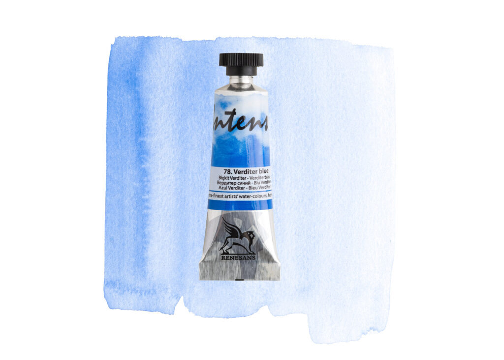
A lovely alternative when you want a fresh, clean-looking blue in your paintings.
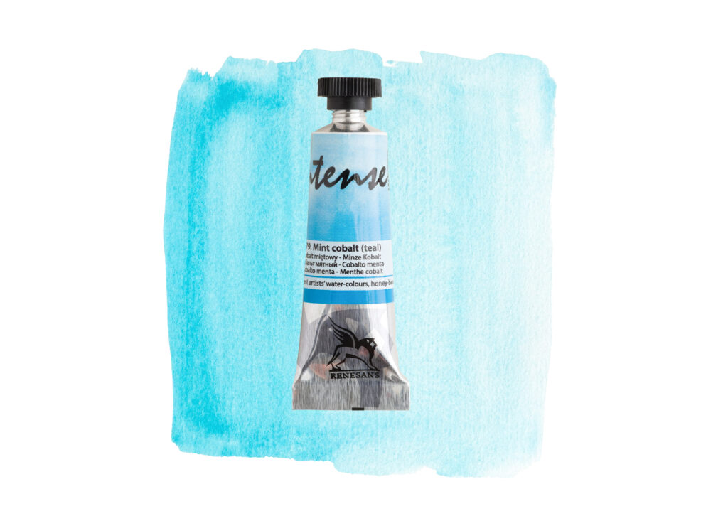
79. Mint Cobalt
A bright, refreshing turquoise with a beautiful minty character. Mint Cobalt brings something a little different to the new collection and is a wonderful option for artists who love blue-green shades.
Think sparkling water, coastal scenes, fresh foliage and vibrant colour combinations.
80. Perylene Green
A deep, muted green with earthy, almost black undertones. Perylene Green is particularly appealing for landscape artists looking to create darker foliage, rich shadows and depth in their paintings.
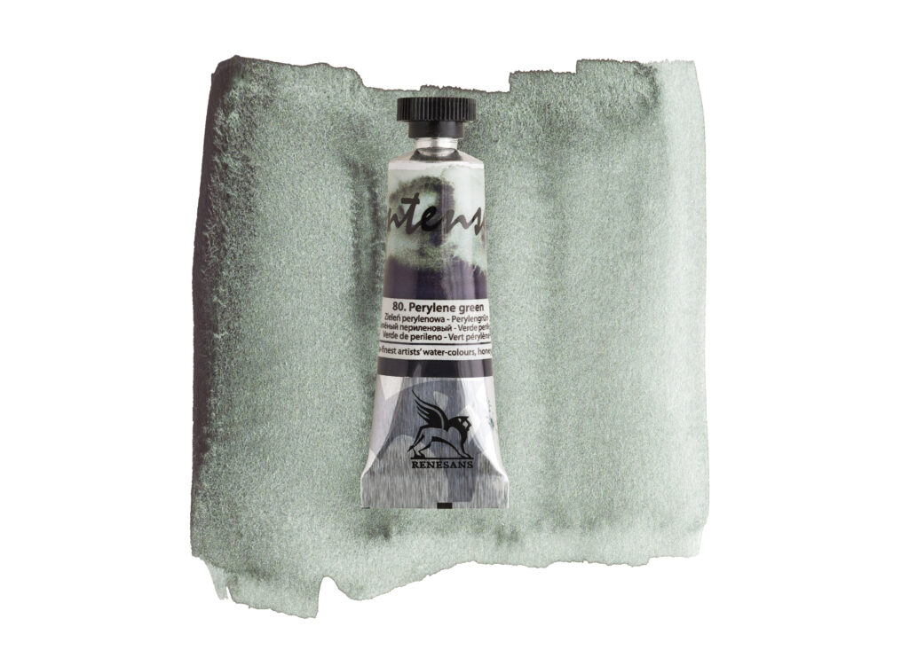
It is also a useful colour for mixing natural-looking greens without everything becoming too bright.
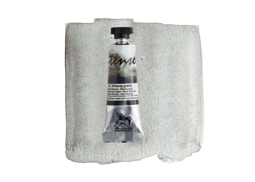
81. Mitoray Green
A soft, natural grey-green with subtle earthy undertones. Mitoray Green is a lovely choice for muted landscapes, foliage, botanical subjects and more understated colour combinations.
If you enjoy painting natural subjects and prefer softer, less saturated greens, this is a shade worth discovering.
82. Masurian Grey
A beautiful deep, smoky grey with muted violet undertones. Masurian Grey offers plenty of possibilities for atmospheric skies, distant mountains, dramatic landscapes and expressive washes.
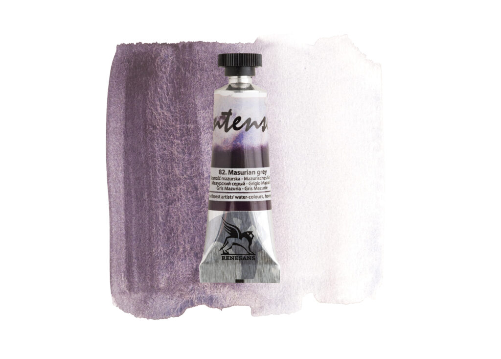
Its interesting pigment movement makes it particularly appealing for artists who enjoy letting watercolour create its own natural textures.
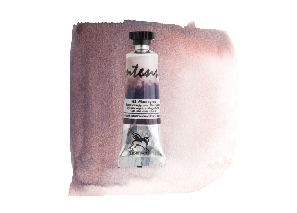
83. Moon Grey
A warm, earthy grey with subtle brown and dusty rose undertones. Moon Grey is a wonderfully atmospheric colour, ideal for natural landscapes, stone textures, architectural details and warm shadows.
It is also an interesting shade to experiment with when creating more complex neutral colour combinations.
84. Lunar Blue
A muted blue with soft grey undertones. Lunar Blue is a beautiful choice for atmospheric landscapes, distant hills, moody skies and textured blue washes.
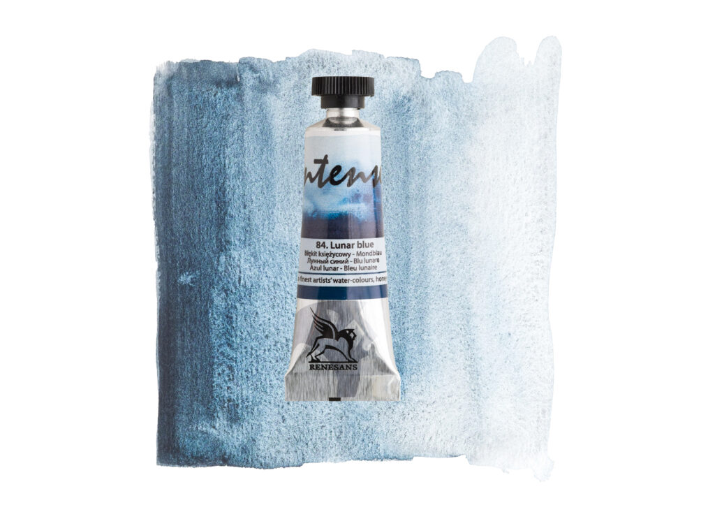
If you enjoy colours that create natural movement and variation on the paper, this is another interesting addition to explore.
What Makes the New Colours Interesting?
One of the lovely things about discovering new watercolours is finding out how they behave once you put brush to paper.
Beyond their individual colours, the new Renesans Intense Watercolour additions offer plenty of opportunities to experiment with different techniques and effects.
Here are a few things worth exploring.
1. Beautiful Granulation and Natural Texture
Granulation is one of the most fascinating characteristics of watercolour.
Rather than drying as a completely smooth, even wash, some pigments settle into the texture of the paper, creating beautiful variations and a naturally textured appearance.
This can be particularly effective when painting mountains, rocks, foliage, old buildings and atmospheric landscapes.
Several of the new shades are described as granulating colours, making them particularly interesting for artists who enjoy textured watercolour effects.
2. Discover Natural Colour Separation
Some watercolours contain combinations of pigments that can separate as they move across wet paper.
This creates beautiful variations in colour, sometimes revealing unexpected tones that are difficult to achieve through conventional colour mixing.
Try experimenting with the new violet, blue and grey shades using wet-on-wet techniques. Apply the colour to damp paper, allow the pigments to move naturally and see what happens.
You may discover some wonderfully unexpected results!
3. Expand Your Colour Mixing Possibilities
Adding new colours to your palette is not just about having more shades to choose from. It is also about discovering new colour combinations.
The new Renesans collection offers everything from delicate pinks and violets to earthy greens, muted blues and atmospheric greys.
These shades can complement your existing colours and provide new possibilities for mixing, layering and creating interesting tonal variations.
4. Find New Colours for Your Favourite Subjects
Different colours can completely change the atmosphere of a painting.
A soft lavender might be perfect for a delicate floral composition, while a deep Perylene Green could bring richness and depth to a woodland scene.
The new shades offer plenty of inspiration, whether you enjoy botanical painting, loose landscapes, urban sketching or more expressive abstract watercolour work.
Which New Renesans Watercolours Should You Try First?
Not sure which colours to add to your palette? Here are a few suggestions depending on what you enjoy painting.
For floral watercolour painting
Bright Rose, Wisteria, Lavender and Mystical Violet are lovely choices for petals, soft washes and expressive floral compositions.
For landscapes and nature
Perylene Green, Mitoray Green, Moon Grey and Masurian Grey offer interesting options for foliage, earthy tones and atmospheric scenery.
For skies and atmospheric paintings
Jaune Brilliant, Alpenglow, Lavender and Lunar Blue are beautiful colours to explore when creating soft skies, distant landscapes and gentle colour transitions.
For experimenting with watercolour effects
Lavender, Alpenglow, Mystical Violet, Masurian Grey, Moon Grey and Lunar Blue are particularly interesting shades to try if you enjoy exploring pigment movement, granulation and colour separation.
Of course, these are just starting points. Some of the most exciting results come from experimenting with colours you might not normally choose.
Explore the Renesans Intense Watercolour Tube Collection
The arrival of these 14 new colours makes the Renesans Intense Watercolour range even more exciting to explore.
Whether you are looking for a beautiful new violet, a fresh turquoise, a rich landscape green or a wonderfully atmospheric grey, there is something here to inspire your next painting.
Renesans Intense Watercolour Tubes are made for artists who enjoy working with rich, vibrant colours and exploring the creative possibilities of watercolour.
Why not treat yourself to a few new shades and see where they take your artwork?
Ready to discover your new favourite colour?
Explore the complete collection of Renesans Intense Watercolour Tubes in our online shop and browse our full Renesans art supplies collection.
With 14 new shades to discover, there has never been a better time to add a little more colour to your palette!
Which of the new Renesans colours would you choose first? We’d love to know!